The brand
A J and a V locked together, leaning forward. Everything on this site comes from that one shape.
One mark, one colour.
Clear space is one J stem on every side. The smallest size is 16 pixels tall. No container, no gradient, no outline.

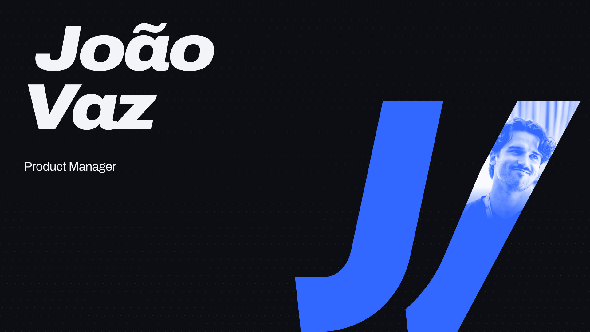
Large, the mark is a window.
The J is flat colour. The V holds the portrait, printed in the same colour, and the print fades out at the collar.

Two grounds, two signals.
Press a colour to copy it. A project page swaps Blue for one accent of its own.
One family, one second hand.
- Archivo, heavy and leaningHeadings and numbers
- Archivo, plain and calmEverything you read
- Caveat, for a few notesAlways in the second colour
- Geist MonoOnly what a machine wrote
The files.
- The markInk SVGPaper SVGBlue SVGOrange SVGInk PNGPaper PNG
- Mark with portraitOn ink PNGOn paper PNG
- Mark with nameInk SVGPaper SVGInk PNGPaper PNG
- Profile pictureDarkBlue
- LinkedIn banner1584 × 396
- Business cardPrint PDF, 85 × 55 mm + 3 mm bleedFrontBack
- Talk opener1920 × 1080
- Email signatureHTMLPreview
- Share card1200 × 630
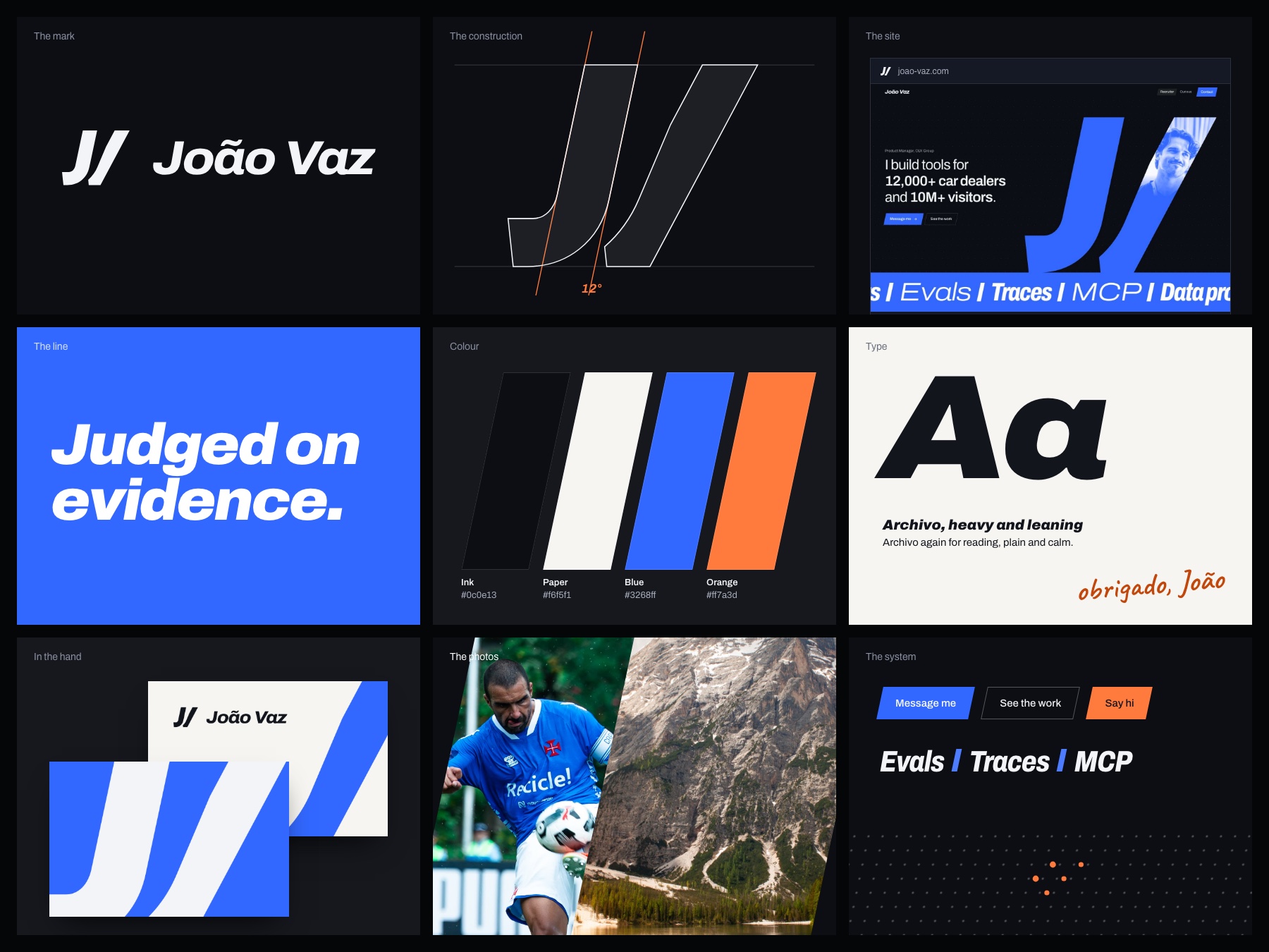
- Brand boardJPG